Na Bràithrean
Modern identity and premium packaging for an ambitious independent whisky bottler.
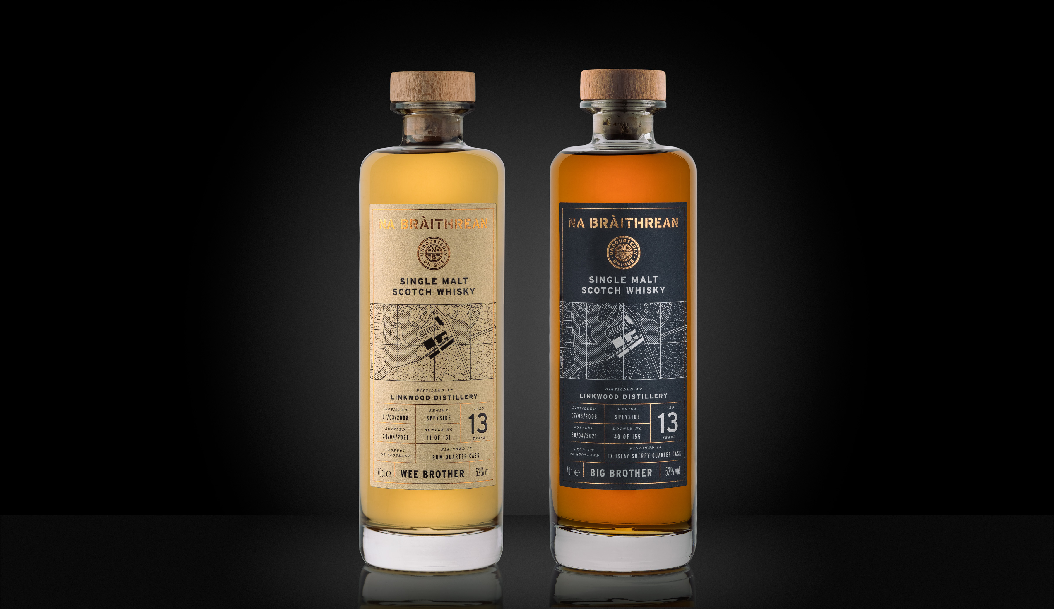
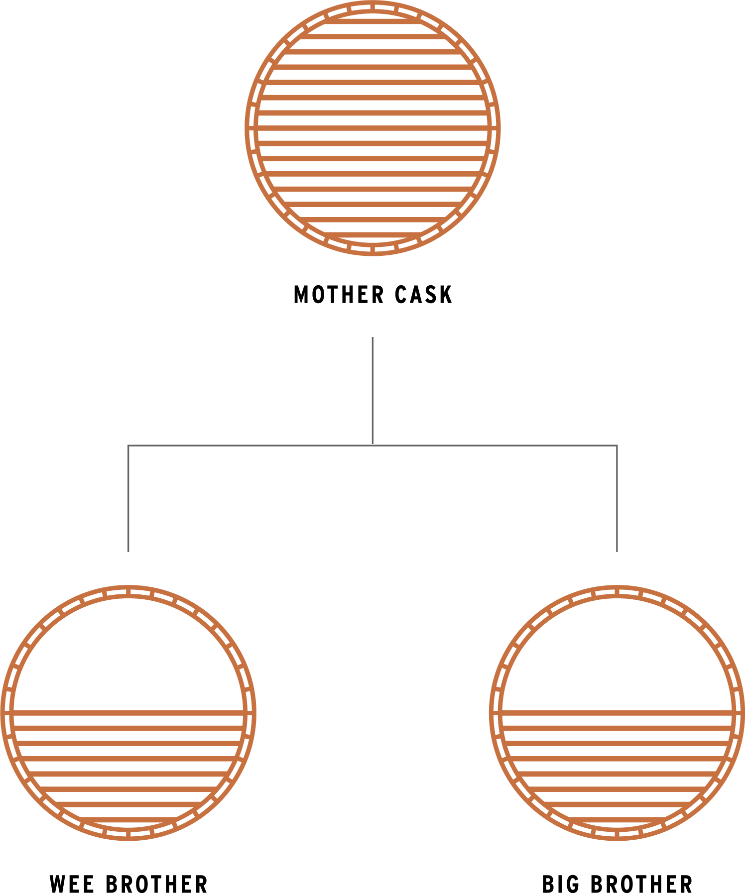
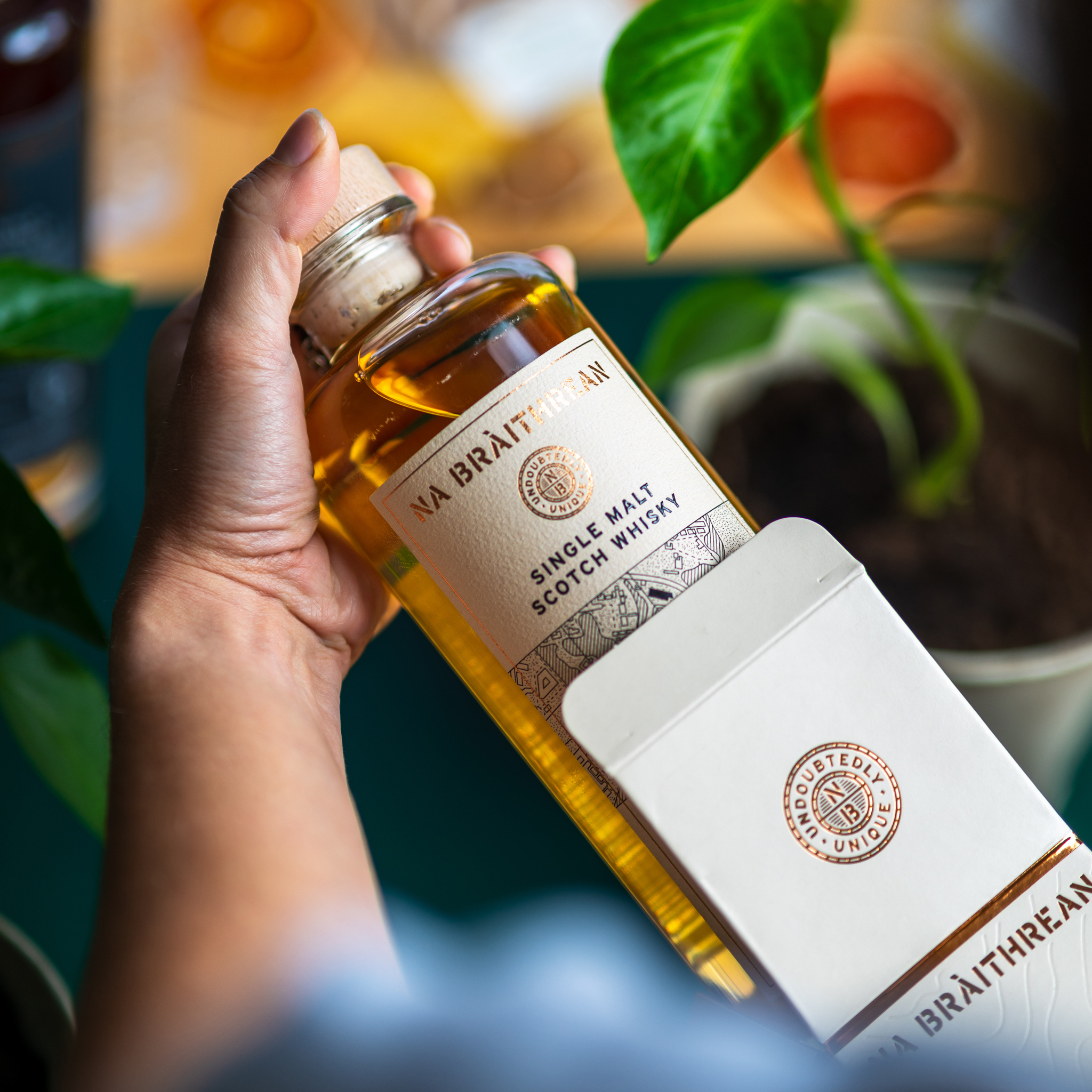
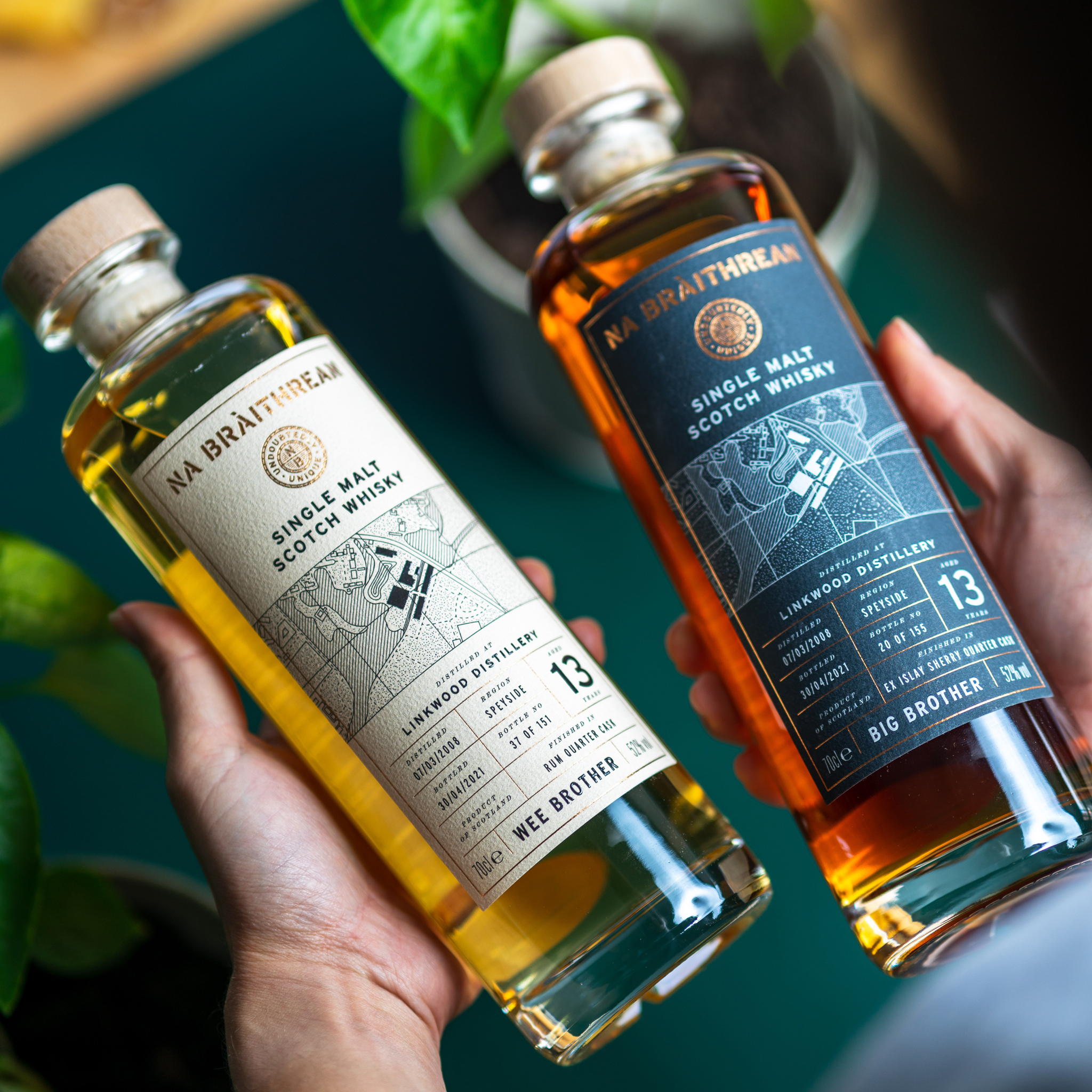
Na Bràithrean (na brah-rin) translates as 'the brothers' in Scottish Gaelic. They release their bottles as brother malts, originating from the same mother cask, but each of them is finished individually in different type of wood and for various lengths of time. The end product is two bottles of the same spirit with different personalities and characteristics.
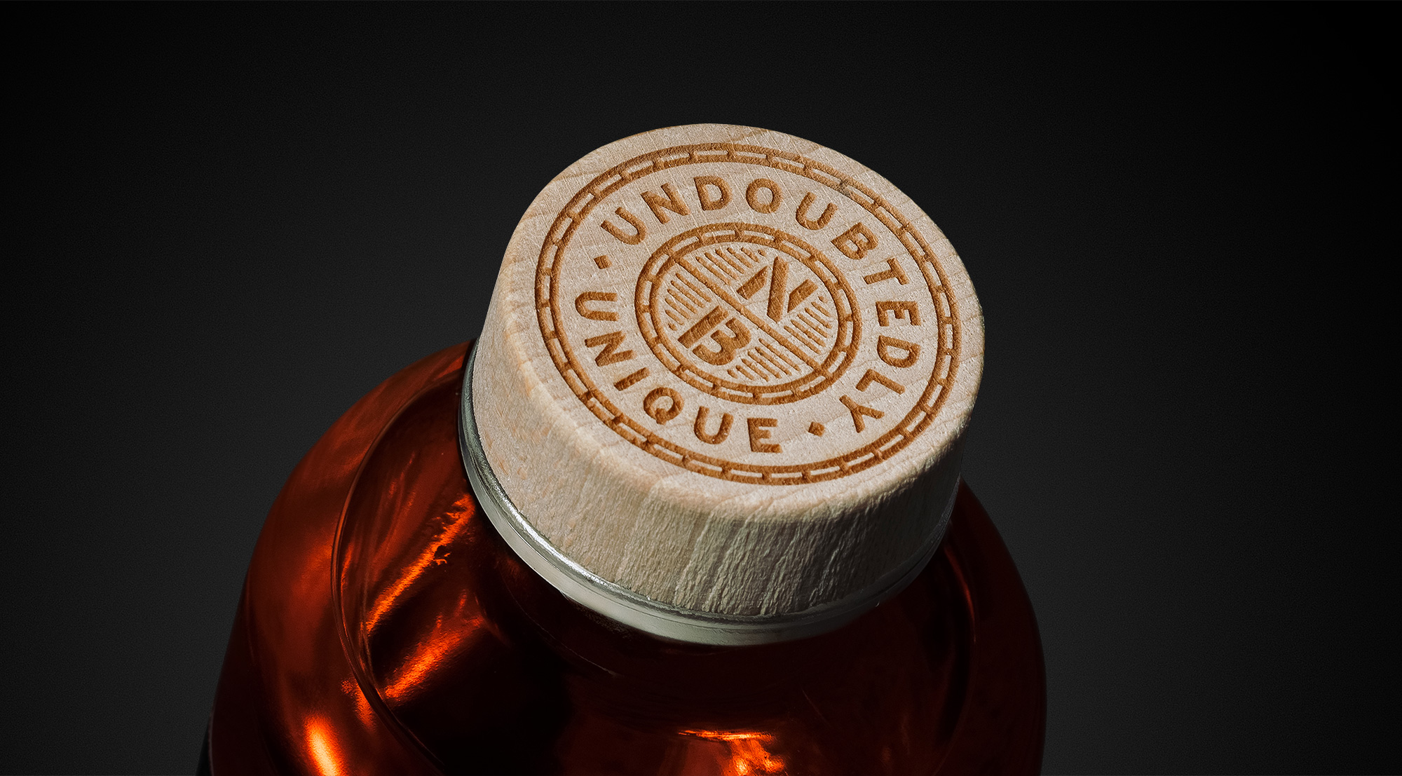

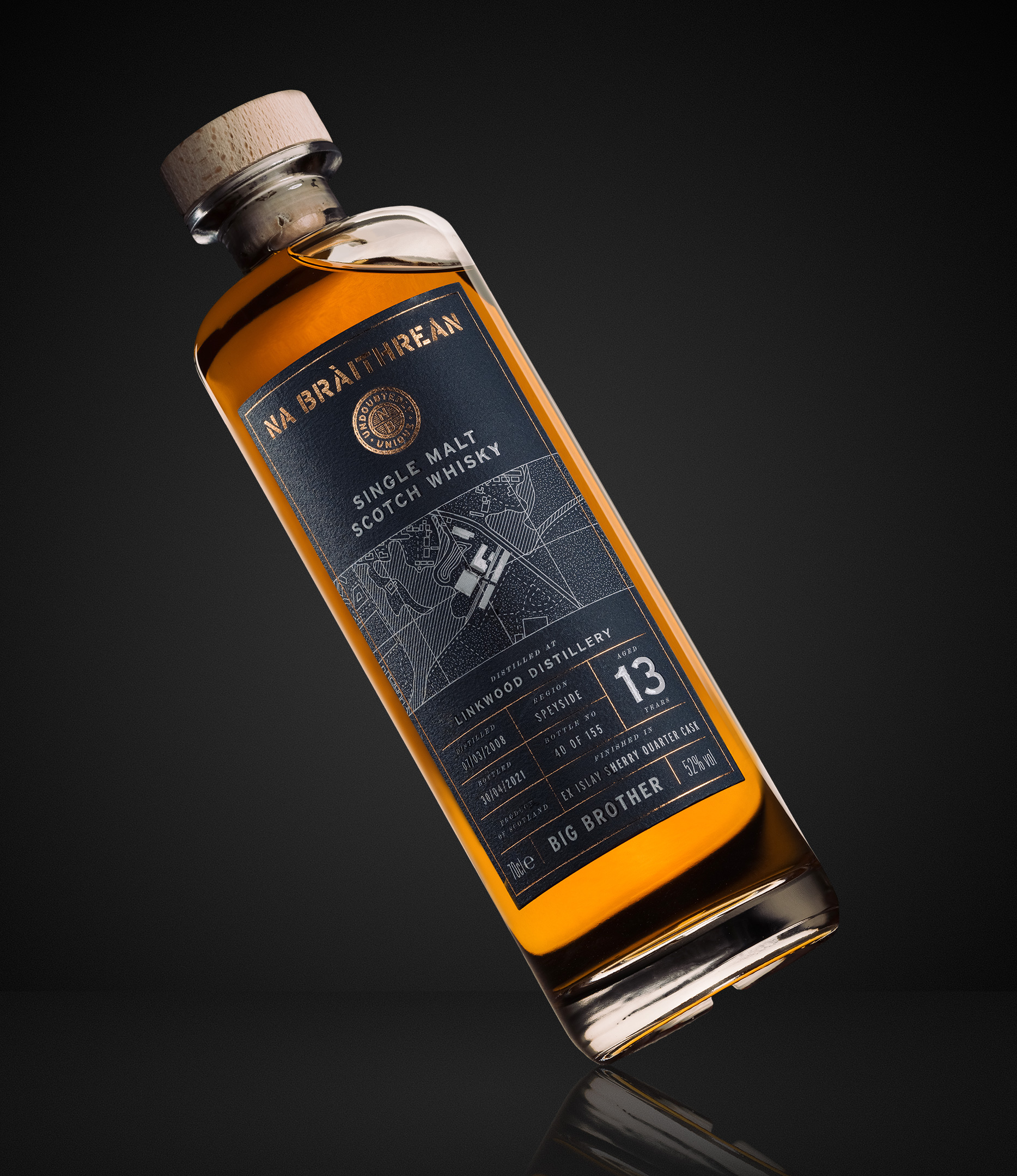
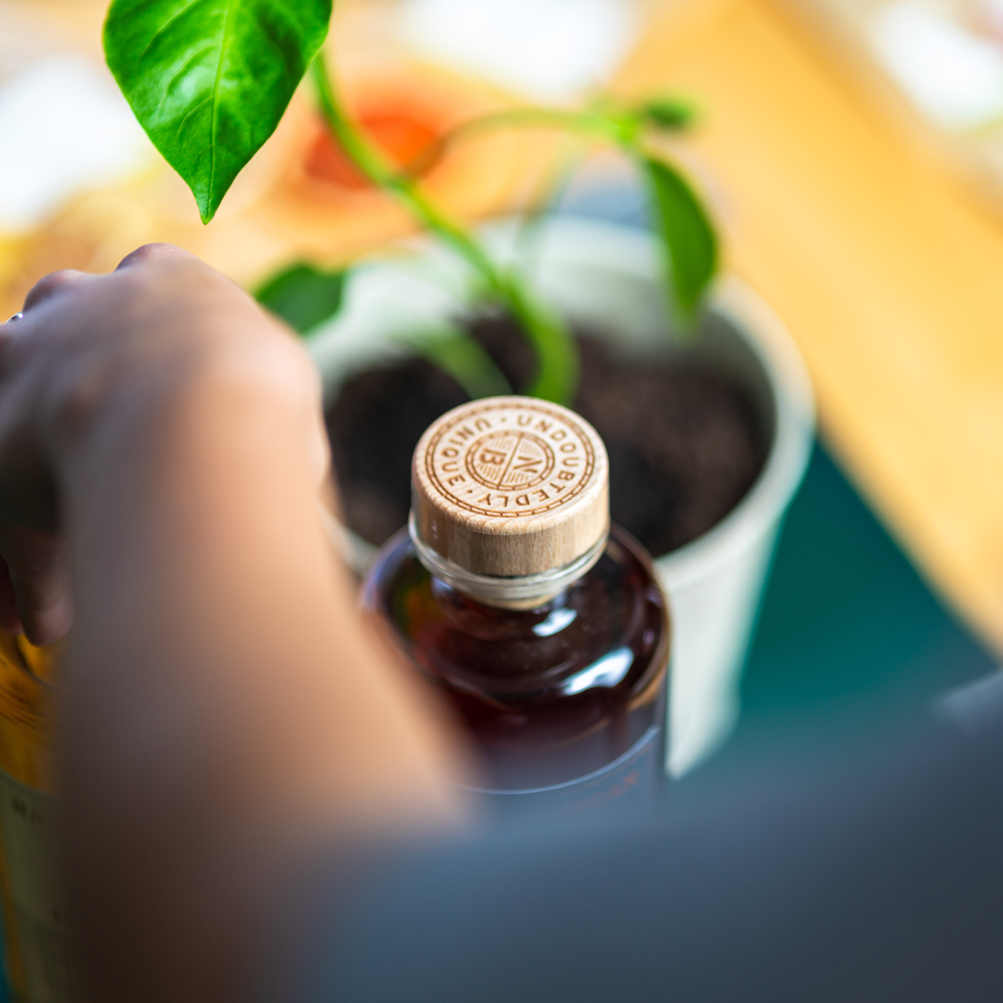
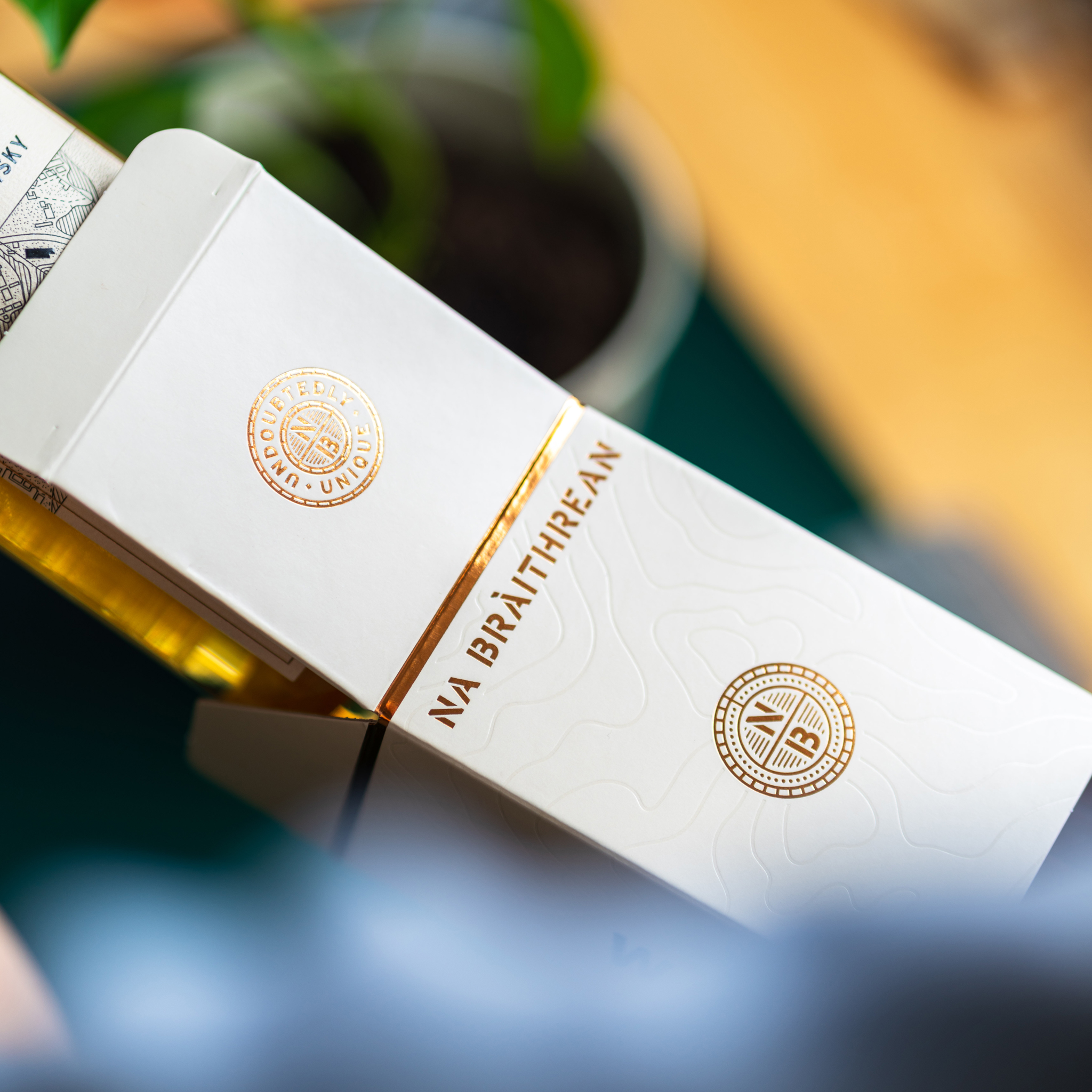
Every aspect of the packaging design for Na Bràithrean reiterates the high-quality liquid inside. From choosing the premium bottle through laser-engraved, natural wood stopper up to beautiful, cotton label stock finished with copper foil and tactile varnish.
Client
Na Bràithrean
Brand
Na Bràithrean
Area of work
Brand identity
Packaging design
Illustration
Brand Guidelines
Merchandise
Print artwork
Designed in collaboration with Ed Bell
Na Bràithrean
Brand
Na Bràithrean
Area of work
Brand identity
Packaging design
Illustration
Brand Guidelines
Merchandise
Print artwork
Designed in collaboration with Ed Bell
︎︎︎